

|
|
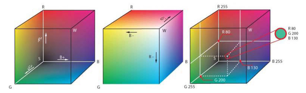
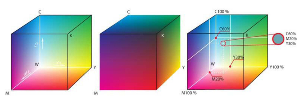
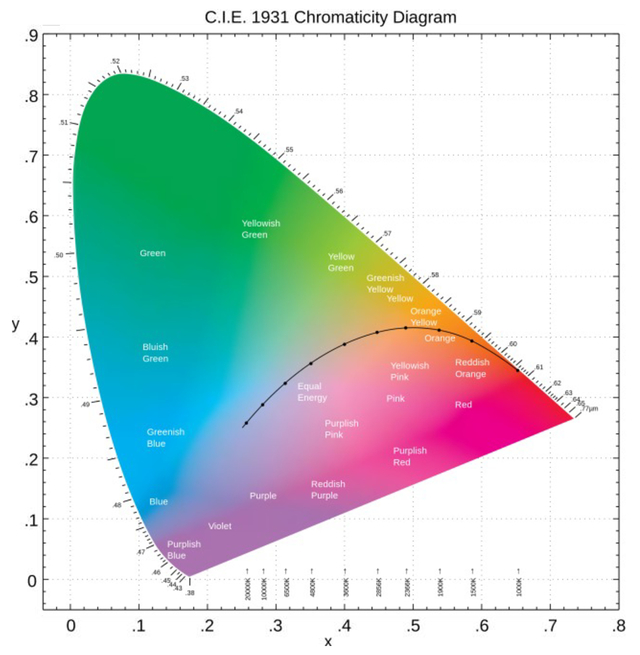
1.INTRODUCTIONAt the Offenburg University of Applied Sciences the students of the department Media and Information Technology get a cross-media insight into the world of the media. In many practical projects they realize print products, films, animations, online projects or Apps. With a broad supply of teaching events all theoretical scientific basics are offered and conveyed intensively. We experience a steady rapid further development in the field of image capturing technologies and display technologies. Cross Media Publishing without a good Color Management System is unimaginable. Color data shall be represented at different display and printing technologies. And of course they shall look visually as same as possible. Ideally the workflow is integrated in a media-neutral environment and adapts the finished color data to the required output devices with the help of an ICC-profile. 2.THEORETICAL BACKGROUNDColor Management has a high place value in the workflow due to the unbelievable variety of different materials for the print and the different digital output technologies. Practical experiments give the students the opportunity for a better understanding how color management works. For the practical experiments the students need a broad theoretical scientific know-how. 2.1From light to colorIn the human visual system the eyes are the sense organ which perceives the light and also colors. James Maxwell formulated 1864 equations to the electrodynamics. With the help of these equations he came to the conclusion: light is an electromagnetic wave (Figure. 1) [1] - [3]. Heinrich Hertz confirmed this experimentally in the year 1886. Light beams contain information which we perceive and process with our visual system. Color is a translation of the information contained in the light beams [2] [3]. Isaac Newton makes an essential contribution to understand color sensation. He investigated the refraction of light, demonstrating that a prism could disperse white light into a spectrum of colors, and that a lens and a second prism could recompose the multicolored spectrum into white light [3] [4]. Over hundred years after Isaac Newton, Thomas Young developed his theory of trichromatic color vision. His basic acceptance is based on the fact that the retina in the human eye has only three receptors for the three primary colors: red, green and blue [5] [6]. The theory was further developed by David Brewster. He drew very exact trichromatic sensitiveness curves and proved that all colors can be mixed with the three primary colors red, green and blue. Hermann von Helmholtz performed the next step in 1850. Based on the research of Young he formulated the trichromatic theory (Young-Helmholtz theory) which is the basis of the modern color reproduction and color rendition [5] [7]. In 1885 Ewald Hering formulated the opponent-process theory. He started with the assumption the visible light falls on the photosensitive retina and is divided there into three different channels. The luminance channel (black-white area) arises from the input of all three cone types [5] [9]. In 1905 Johannes von Kries formulated the modern duplexity theory of vision. Color perception works in two levels. In the first level colors arise in our perception by spectrally different pigments in the cones which absorb the light of a certain wavelength area. In the second level color channels take place by the three groups of cones (photoreceptors). They absorb the light of a short wavelength (S, blue), of a middle wavelength (M, green-yellow) or of a long wavelength (L, red). The two color channels are red-green and blue-yellow made from combination of these signals. This additional level of the color eyesight opened up the complete visible spectrum for us [5] [10]. 2.2Development of the color representationThe world of our media is colored. Nevertheless print is traditionally known as the art of printing. The modern printing technology with four colors (CMYK) was developed at the beginning of the 1930s years. If at first a reliable color representation was restricted to special closed systems in the pre-press, this has changed strongly by the technological progress in the photography and in electronics [5]. The computer and the associated digitalization changed the complete printing industry and created a new media world. Much has changed primarily in the field of the pre-press color reproduction. Today the industry works with standardized workflows in open systems with many partners and many different input and output devices. Basic knowledge and experience are a necessary prerequisite for a perfect color rendition with a color management system. Color management means the color customization of all input and output devices involved in the production workflow. So it is possible to receive a color right output at every time of the production process. The ascertainable and representable colors of input and output devices differ strongly. In the modern approach of color management is it necessary to interconnect different devices about the intermediate step of a neutral color space. The device-dependent color descriptions are converted into each other with the help of the device-independent exchange color space. This step makes it possible that different output devices represent the colors nearly equal. An exactly identical representation is not possible [11] - [13]. We expect color consistency from the perception until the output. Because colors don’t have any units, colors must be defined. We need a system to describe colors exactly. Colors must be in the position to be captured by gauges. Depending on the technical application we use different color systems in the production workflow. No one reach the requirements of all applications and can be used as a central model. These color systems are usually represented three-dimensionally. Definite numerical values as color position are assigned to all colors within the color system. Mathematical formulae and geometric models describe as the human visual system puts colors in a relationship to each other. A color space is the practical application of a color system and should contain all representable colors within the color system if possible. This is the so-called Gamut which fixes absolute values for colors. A device color space contains the Gamut which a device used in the workflow can record or print out [11] - [13]. The RGB color model (Figure 2) is a three-dimensional color space which reproduces the color perception by the additive color mixture over the primary colors: red, green and blue. It is based on the trichromatic theory and is used for self-luminous systems like screens, displays and projectors. All colors are described and stored with three values for RGB. The CMYK color model (Figure 3) is a generic color system which describes the technical mixing ratios. The description is independent from the used basic color. It was developed from the CMY color model for printing. As key -K the additional colored printing ink black was introduced. Theoretically, printing the three primary colors cyan, magenta and yellow one above the other results black. Practically no sufficient black arises. This is primarily due to the technical composition of the colored printing ink. None of the used pigments have the visual qualities of an optimal color [5], [11] - [13]. In 1931 the CIE (Commission Internationale de l’Eclairage) published the CIE 1931 color space as one of the first international norms which is based on the definition of color as a visual function (Figure 3). The subjective color perception was attributed to general tristimulus values in a series of experiments with different test persons. As reference stimulis the real monochromatic colors spectral red (700. 0 nm), spectral green (546. 1 nm) spectral blue (435. 8 nm) were used. The result of the standardization was the CIE 1931 XYZ color space based on the color matching functions of the CIE standard observer. With the CIE 1931 color space chromaticity diagram a more descriptive and manageable two-dimensional diagram was created. By the loss of a dimension there is no more statement about the brightness possible [5] [12] [13]. In 1976 the CIE introduced the CIE Lab color space. Deficits of the CIE 1931 color space were cleared with the help of mathematical transformations. In practice there were problems with the specification of tolerances for the chromaticity defined about x and y. The deviation can be found out arithmetically about the difference of the two vectors but frequently didn’t agree with the difference visually perceived. The CIE Lab color system is an infinite three-dimensional color space with the three coordinate axes L* (brightness), a* (green-red axis) and b* (blue-yellow axis). The chroma diagram is the simplified two-dimensional description over the a*b* level for L* as a level of constant brightness [5] [12] [13]. 2.3From CIE-Lab color system to color managementColor management took his beginnings in the color reproduction of the pre-press. It developed quickly with the lasting technical change of the 1980s and 1990s and the transition of the electronic color reproduction to the desktop publishing. All these technological changes are designed for the interchangeability of digital color information. In 1993 and in 1996 the standardization committees ICC (International Color Consortium) and the ECI (European Color Initiative) founded himself. This was the beginning of color management. These committees worked out open standards for color profiles of input devices and output devices. The first steps to a working color management system were made [5] [11] - [13]. ICC color management (Figure 5) is an important part of the color reproduction. The aim is to ensure color consistency during the production workflow between different input and output devices as good as possible. The color management system works with a device-independent color space which is described as profile connection space (PCS). Every device in the production workflow has an own standardized technical device-profile. It contains the definition of the device-dependent color space. Device-depend color spaces are often very different in her reproducible color scale from each other. The use of a device-independent color space (medium neutral) decouples them of each other. Now it is possible to convert graphical data into different technical color spaces with a high color consistency. [5] [11] - [13]. 3.APPLICATIONSIn color management a development takes place away from the classic print products to the digital output devices and mobile displays. The origin of the color management is the color reproduction of the pre-press. Much was done to ensure a general, reproducible and predictable color consistency by the complete production workflow up to the printed product. An important factor is the possibility to get a meaningful or color proof output at any time in the complete production process. For a long time printed contact proofs were in the center of the communication between customer and printing department. This role will be taken over more and more by soft proofing (monitor proofing) systems. It is a great challenge for all partners in the printing industry. Soft proofing systems rely on calibration, profiling and color management to produce an accurate representation of how images will look when printed. Many factors can contribute that image template and monitor presentation are visually considerably different despite smallest metrological color distances and best hardware and software. The sum of all influences on the complete system must be standardized and correct [11] - [13] [17]. 3.1Colors and digital display devicesThe students also shall develop sense of the color representation on screens besides the theoretical scientific bases. For that purpose various monitors and displays are measured with different gauges. We want to reach a sensitization for the topic color management and work out differences in the color representation by different display technologies. The first testing environment (Figure 6) uses the Konica Minolta CRT Color Analyzer CA-100 with the software LabVIEW 5.0 (National Instruments). With different tasks the students are to be introduced to the color representation on screens and displays. The CRT monitor has to be adjusted to true color mode. Initially the students have to measure the primary colors red, green and blue of the monitor with the color analyzer. Then the secondary colors cyan, magenta and yellow are to be measured as well as white and black. The measured values are to be graphed into a self-prepared norm chromaticity diagram. This task serves to objectify the color impression on a screen so that at misrepresentations of colors suitable countermeasures can be taken up. To sharpen the understanding of the color representation, two primary colors are to be selected for a dithering field. The raster should be adjusted on values 200, 100, 50, 10. Then the selected colors must be reproduced over three regulators for red, green and blue and are to be measured for comparison purposes. This is a very good training for the visual color perception. The effective direction of the three basic color channels is trained intensively. Now the color temperature of the monitor has to be determined. A color field is to be adjusted for white and then the values for Yxy are to be measured. The black body spectrum of the measured color temperature will be represented with the software. Then the students have to calculate the corresponding tristimulus values. The values of the measured white are to be graphed into the norm chromaticity diagram and then Δuv is to be interpreted. Finally the students have to work with color rows (Figure 7). The first step is to differentiate neighboring color fields. This is only possible if the difference between neighboring color fields is big enough. With the help of the software own color rows can be produced. Simultaneously the color values of the color analyzer can be saved and represented on the computer. With the help of suitable color rows it is possible now to declare the Gamut of the monitor. In the same way the gray row is to be measured and then the brightness curve is to be explained. Now contrast and brightness of the monitor have to be varied and more brightness curves have to be taken for a determination of the gamma value. A visual rough determination of the gamma has to be carried out with a test card. 3.2More possibilities with the spectrometer JAZNew much more interesting possibilities offer the spectrometer JAZ of Ocean Optics in Figure 8. At first the students measure different lamps to get some basic knowledge about the device. The spectrum of a glow-discharge lamp will be measured. With the measured values is to decide what kind of glow-discharge lamp it is. Figure 8.Measurement environment of the spectrometer JAZ (Ocean Optics) for differently colored LEDs. 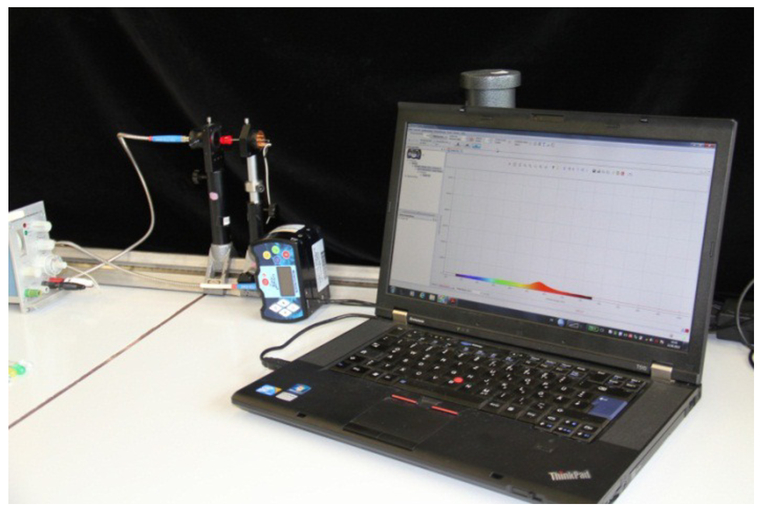 Base for the next measurement series are differently colored LEDs. The different spectra of the LEDs have to be visualized. With constant power the voltage of the LEDs are to be measured and the wavelength of the colored diodes has to be determined (Figure 9). In the Software are different illuminant standards deposited. One of them has to be selected for the white diode. First a reference spectrum is to be taken with this standard and after this a dark spectrum. Then the other diodes are to be measured in the norm color field. The measurement series is to be repeated with further deposited illuminant standards. All measured xy values are to be displayed into a norm chromaticity diagram. Figure 9.Measurement setup with different colored LED (white, red, yellow, green and blue) and the corresponding spectrum 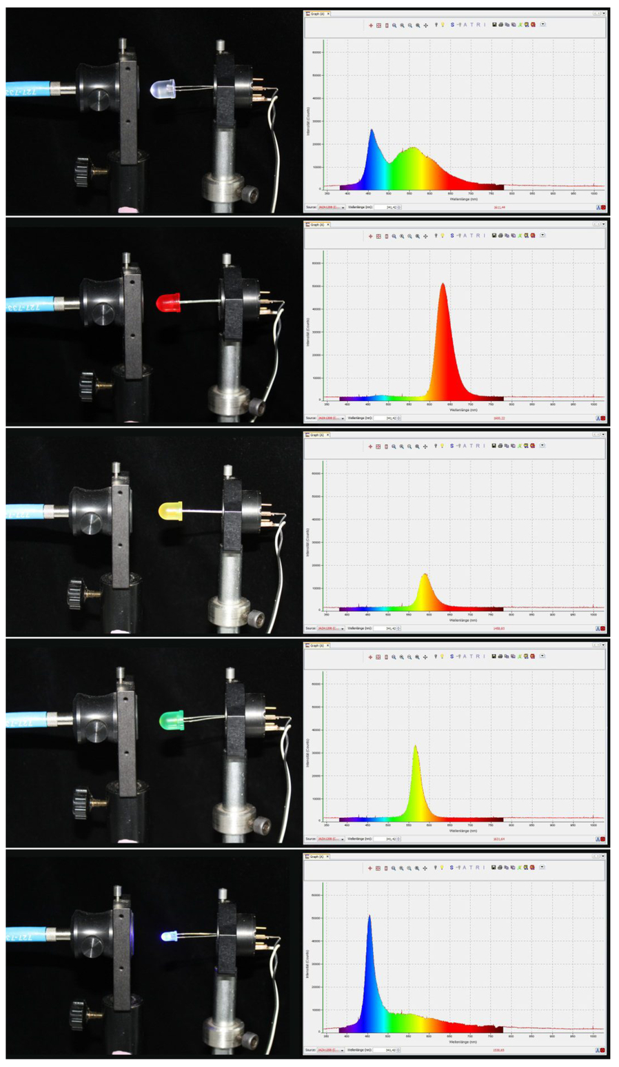 Now the color representation on different displays is the center of the measurement. Three digital output devices are available. On a laptop computer, on a tablet-PC and on a smartphone the same prepared test card is displayed. At first the image representation has to be evaluated visually and then measured with the spectrometer on every device. The visual assessments and the measurements have to be correlated with each other. The next task is to calibrate the three devices with the color calibration solution Spyder (Datacolor). After the calibration the identical test card is represented once more. Again the representation has to be evaluated visually and then measured. The results have to be correlated with each other and discussed. Finally the same test card is represented in four different color spaces on the display of the laptop computer. This visually often means an obvious change of the color representation. The changes have to be evaluated very detailed and then measured. It is very important to establish a correlation between the results. The students develop a good appreciation of the mode of action of different color spaces for the same data. 4.RESULTSStudents need practical experience for a better understanding of color representation in the media technology. To convey and deepen the important theoretical basics, practical tests and exercises are essential. The students can be confronted with practical problems. About the problem solution theoretical scientific backgrounds can be deepened very well. A strong awareness raising for important topics like color representation and color management will be increased. Positive results will be scored in the examination. Especially the objectification of the color impression and the training of the visual color perception have a very positive effect. This increased understanding has a positive effect on the various design projects for print and web. The reaction capacity on color misrepresentations is increased considerably. A deeper understanding is created just in the area of the digital color representation. By use of different screen technologies a broad comparison base is created. Characteristics like white point, brightness curve and Gamut give insight into the efficiency of the single display technologies. This knowledge offers the students the possibility to make tendentious forecasts about the color representation on digital output devices. So they can already work correspondingly in the project realization. Predictability and consistency in the color representation are the aims of a color management system. This is only possible in a standardized and audited production workflow. The importance to calibrate the devices is demonstrated very plastically. Consequences of the choice of a defined color space on the color representation lead to aha moments again and again. Altogether, most participating students react considerably more sensitively to the topics color management and color representation on digital output devices. It becomes apparent primarily in the numerous project works in which the whole world of the media technologies from print, film, web up to the mobile app is used. The color representation of the finished product on the chosen output device is earlier and more often a discussion point in the production process. The workflow is media neutral. Only the finished product will be adapted about a data profile to the chosen output device. 5.PERSPECTIVEWith a composite form of theoretical and practical lectures very positive results can be achieved. Seen from the angle of knowledge transfer, these results show the way to more practical education in a scientific and also production technical direction. It is to consider that design and development of a suitable learning environment with the required infrastructure and corresponding investments are necessary. From the scientific view the color perception of a human observer shall be examined. Needed is a test environment to simulate the CIE regular observer with current display technologies are integrated. It is not working with spotlights in the primary colors red, green and blue. The colors are represented and mixed on digital display devices. Now several issues and problems can be studied scientifically. How do mixed lighting situations have an effect? Which influence do these have on the adaption of an observer? How are the results at different digital display technologies? Which person-dependent variances of the color perception exist? From a practical production-related view teaching and learning contents shall be realized in another project. The Project 〜Multimedia Newsroom - learning editorial team for students” is in the conception phase. A multimedia editorial department is planned with a complete color management workflow including a softproofing solution. It is aim to create daily current contents media neutrally and then to publish them cross media. Primary media will be the online newsroom to publish texts, images, video and audio streams. Social media channels will be used and a print magazine will be published regularly. REFERENCESHenke, H.,
“Elektromagnetische Felder – Theorie und Anwendung,”
Springer-Verlag, Berlin Heidelberg
(2001 und 2004). Google Scholar
Kühlke, D.,
“Optik – Grundlagen und Anwendung,”
Wissenschaftlicher Verlag Harri Deusch GmbH, Frankfurt am Main,
(2004). Google Scholar
Knight, R.,
“Physics for Scientists and Engineers,”
Pearson Education, Inc., publishing as Pearson Addison-Wesley, Sansome St., San Francisco, CA
(2008). Google Scholar
“Optics, or a treatise of the reflections, refractions, inflections & colours of light,”
4Dover, New York
(1704 und 1952). Google Scholar
Simon, K.,
“Farbe im Digitalen Publizieren,”
Springer-Verlag, Berlin Heidelberg
(2008). Google Scholar
Young, Th.,
“On the theory of light and colours,”
Philos. Trans. Roy. Soc. London, 92 210
–270
(1802). https://doi.org/10.1098/rstl.1802.0004 Google Scholar
Von Helmholtz, H.,
“Tiber die Zusammensetzung von Spektralfarben,”
Poggendorfs Ann. Physik, 94 1
–28
(1855). Google Scholar
Frank, H., Phrood, Anony,
“Electromagnetic_spectrum.jpg,”
(2005 und 2008) http://www.commons.wikimedia.org/wiki/File%3AElectromagnetic_spectrum.svg Google Scholar
Hering, E.,
“Grundzuge zur Lehre vom Lichtsinn,”
Handbuch der Augenheilkunde, Leipzig
(1905). Google Scholar
Von Kries, J.,
“Die Gesichtsempfindungen,”
Im Handbuch der Physiologie des Menschen, 3
(1920). Google Scholar
Kusterka, W.,
“Colormanagement in der Farbreproduktion,”
Verlag Dr.-Ing, Paul Christiani GmbH & Co. KG, Konstanz
(2012). Google Scholar
Fiebrandt, D., Koch, C.,
“Farbkonsistenz in der Profifotografie,”
Addison-Wesley Verlag, Munchen
(2010). Google Scholar
Homann, J.,
“Digitales Colormanagement,”
Springer-Verlag Berlin Heidelberg(1998, 2000, 2007). https://doi.org/10.1007/978-3-662-21823-5 Google Scholar
Frank, H.,
“RGB_farbwuerfel.jpg,”
via Wikimedia commons,
(2004) http://commons.wikimedia.org/File:RGB_farbwuerfel.jpg Google Scholar
Frank, H.,
“CMYK_farbwuerfel.jpg,”
via Wikimedia commons,
(2004) http://commons.wikimedia.org/File:CMYK_farbwuerfel.jpg?uselang=de Google Scholar
Paulschou,
“chromaticity_diagram_full.pdf,”
via Wikimedia commons,
(2009) https://commons.wikimedia.org/wiki/File%3AChromaticity_diagram_full.pdf Google Scholar
Schurr, U.,
“Prepress-Knowhow fur Grafikdesigner,”
dpunkt.verlag GmbH, Heidelberg
(2011). Google Scholar
|


